Shophouses were a convenient design for urban settlers, providing both a residence and small business venue. Shophouses were often designed to be narrow and deep so that many businesses can be accommodated along a street. Each building’s footprint was narrow in width and long in-depth. The front area along the street was a formal space for customers, while the rear areas were informal spaces for family members, toilets, bathrooms, kitchens, and infrastructure. Let’s discover 7 stunning shophouse architects features in Singapore.
1.Shophouse Architects Features: 55 Blair Road by ONG&ONG
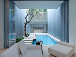
Architects ONG&ONG have completed a contemporary open-plan interior for the renovation of a terrace house in Singapore, merging the interior and exterior spaces. 55 Blair road project is a renovation and restoration to a traditional art deco style shophouse. Originally the house was renovated 10 years ago. The new owner however believed it was too dark and desired more light in the living spaces. The design is a response to the owner’s request to introduce more light into the living spaces which were previously too dark. A large void divides the two sections of the house allowing light to penetrate the interior and providing natural ventilation. Aluminium cladding on the walls of the internal courtyard reflects more natural light into the interior spaces. With the glass partition doors of the first-floor open, one large living area is created connected by platforms over a pool. The rear section of the house has been allocated as the services area and the front section of the living quarters. 55 Blair Road produces a spatial experience that excites the senses by promoting light open plan living which is unusual to this type of terrace house. This residence brings a balance between nature and contemporary living in a renovation of a Heritage Art Deco style shophouse architects features. The concept is to create a light open plan living space, whilst promoting inside/outside space. The contrasting relationship between the metallic elements and subtle tones within the house creates an exciting spatial relationship throughout.
2.Shophouse Architects Features: The Periscope by VW+BS
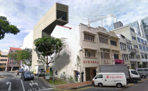
London studio VW+BS has designed an office building for Singapore that resembles a giant periscope. The Periscope is an office building located in the Upper Circular Road conservation area in Singapore. Made up of warehouses and shophouses that serviced the commercial activity around the nearby Singapore River until the latter half of the 20th century, the area has recently undergone regeneration and the restored buildings now accommodate offices, hotels, restaurants, and shops. Tacked onto the rear of a listed 19th-century shophouse architects features, The Periscope will have a dramatically cantilevered top floor that will oversail the existing roof. This cantilever will contain a top-floor restaurant above four storeys of offices. The building is to be constructed of reinforced concrete, infilled with perforated aluminium panels on the front and rear facades. A two metre-wide gap will separate the extension from the shophouse, which will be refurbished to provide offices on the first and second floors. The project is currently awaiting approval from the local planning authority.
3.Hatched at Holland Avenue by Outofstock
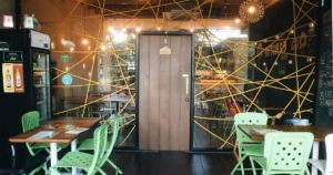
Birds’ nests inspired the facade of this Singapore cafe by designers Outofstock, where eggs are served all day. The bright yellow web of rope matches the colour of seats outside, as well as the handle of the wooden door. Floorboard offcuts are stacked up to create a bar on the ground floor and other surfaces are picked out in chunky chipboard. Irregularly shaped lighting fixtures decorate the walls on the upstairs floor, which the architects liken to hatching eggs or peeled potatoes. The second Hatched restaurant that Outofstock have created, following one with egg-shaped holes in the walls from 2010. Following the popularity of the first Hatched restaurant, Singapore and Barcelona based design collective Outofstock was recently commissioned to design a second restaurant at 267 Holland Avenue, Singapore. Located in a two-storey historical shophouse in Holland Village, the design of this egg-themed, all-day breakfast restaurant is based on the concept of a nest.
The intention behind the shophouse architects features design was to inject more colour and playful elements into the new restaurant, building upon the warm and cozy barn house atmosphere of the original establishment, also designed by Outofstock. The nest facade was realized with yellow braided rope woven around a steel frame with laser-cut holes. This steel frame also holds up the glass panels and a floor-sprung rough-sawn timber door. The restaurant uses mostly original lighting and furniture designed by Outofstock, such as the Naked chair, produced by Bolia and the Biscuit stool and table, produced by Environment. The bar counter is composed of offcuts from teak wood floorboards. The floorboards were used to compose a herringbone pattern, hence the almost perfect triangular offcuts. Abstract wall lighting fixtures which could be interpreted as hatching eggs or peeled potatoes act as conversation pieces on the upper floor of the restaurant.
4.The Pool Shophouse by FARM and KD Architects
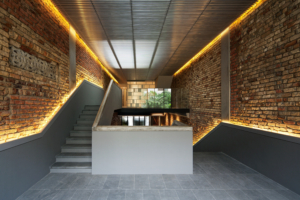
Architecture studios FARM and KD Architects have converted a 1920s shophouse in Singapore into a residence with a swimming pool stretched along the ground floor. Long, narrow shophouse architects features are a typical building typology in Southeast Asia and the Pool Shophouse is one of eight renovated properties in the Lorong 24A Shophouse Series, for which various architects were asked to adapt and extend properties in the Geylang neighbourhood. Architects Tiah Nan Chyuan and Lee Hui Lian explain how they wanted to create “an insertion” rather than “an extension” to the building. “One experiences the continuity of space through a series of stairs that loop through the shophouse,” they say. The staircases they refer to zigzag back and forth through the house to connect the three existing floors with the four-storey extension, which contains bedrooms within its upper storeys. Narrow strips of lighting highlight the gaps between those new staircases and the exposed brick walls of the original building. Light filters into the house through a skylight at the centre, which is screened behind a louvered ceiling.
5.Shophouse Architects Features: Niven Road Studio by WOW Architects
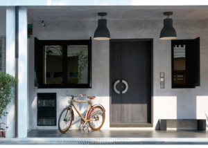
Almost 20 years after buying a shophouse in a historic Singapore neighbourhood, local architect Maria Warner Wong and her team have converted the building into a new venue for art and design. Warner Wong bought the property in 1996, seven years before her and business partner Wong Chiu Man established their architectural studio WOW Architects. At the time she thought she could replace the building with a new live/workspace for herself. The architect faced a few hurdles – the largest being that the building was heritage listed in 2003, limiting the options for redevelopment. In the end, she decided to restore and extend the building to create a new cultural space for the city. “After the building was gazetted by the Urban Redevelopment Authority, we could no longer realize the plan to rebuild,” she said. “We had to keep the existing building, but it did have a small amount of land at the back that we were allowed to use for an extension.” “In the end, it took us 19 years to complete, because in the years between we were nurturing a practice and a family, plus a few global economic obstacles came along,” she added. “In between, we were focused on getting the building approved.”
Named Niven Road Studio, the building is located in a residential neighbourhood in the centre of the city, between the busy Middle Road entertainment district and the quiet Mount Emily park community. It was originally built as a shophouse – a historic building typology in Southeast Asia that typically contains a shop at ground level and a residence on one or two floors above. WOW Architects restored the building’s original interior, leaving surfaces unfinished to reveal rugged brickwork and the undersides of terracotta roof tiles. It then added a taller extension at the rear, using bare concrete and glass. The aim, said Warner Wong, was to provide a visible contrast between the new and old sections of the building. “Beyond the old and new exterior, the shophouse architects features present a rich duality of spatial experiences formed by the architectonics of the load-bearing off-form concrete walls against the existing dual-tone red brick walls and the ventilated terracotta roof tiles.”
6.Shophouse Architects Features: Esora Restaurant
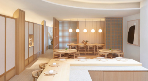
Minimalist interiors draw attention to the open kitchen of this shophouse architects features Japanese restaurant, which Takenouchi Webb has created inside an old Singapore shophouse. Decked out with pale timber surfaces and pared-back furnishings, Esora has been designed to give centre stage to the dining experience. It is located in Singapore’s River Valley district and was formerly a shophouse – a common building typology seen around Southeast Asia that combines a workplace with a residence. The 26-cover restaurant will serve Kappo-style Japanese food under the guidance of chef Koizumi. Translating to “cut and cook”, Kappo involves a chef openly preparing a multi-course meal in front of diners so that they can observe and appreciate the culinary process. “As the restaurant was to be arranged around the chef’s table, this became the centrepiece of the restaurant,” explained locally based studio Takenouchi Webb, which was charged with developing Esora’s interiors. “Through our discussions with the chef and the client, we slowly developed the language of materials and form of the space.”
The ground floor is now centred by a cooking space, which is enclosed by an L-shaped wooden block of seating. Part of the flooring here has been lowered so that the chef must step down to use the prep counter, aligning his eye level with diners and fostering a more intimate atmosphere. Overhead is a semi-circular glazed opening that has been overlaid with Japanese washi paper, diffusing natural daylight in what the studio describes as a “cloud-like” manner. At the rear of the room is a small kitchen decked out in jade green tiles and a drinks bar crafted from veiny grey marble, where guests can take part in a tea-pairing experience. The bar’s curved form, coupled with the arched grooves in the ceiling, is meant to give the restaurant a sense of “underlying calm”. The rest of the restaurant accommodates a couple of four-seater tables and a private dining room that can be completely closed off by sliding gridded screens. Five pendant lamps are suspended from the ceiling in a row, emitting a warm yellow glow. Decor has been restricted to a few abstract paintings, copper cooking pots, and vases filled with pampas grass and white-budded honesty flowers.
7.Canvas House by Ministry of Design
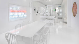
Ministry of Design has created completely white interiors for this co-living space, which occupies a traditional shophouse in Singapore. Situated at the heart of Singapore’s buzzing Tanjong Pagar neighbourhood, Canvas House provides shared accommodation for creative locals and members of the ex-pat community. It takes over a four-storey shophouse – a type of building commonly seen around Southeast Asia, which has a commercial business at its front and living spaces at its rear. Locally based Ministry of Design completed the interiors of Canvas House, which soft-launched at the beginning of this year and already has a handful of tenants. Almost every surface has been painted white, an attempt by the practice to “provide a canvas” for any future aesthetic alterations that may be carried out. Original surfaces, such as brickwork and timber stair treads, are revealed here and there through circular incisions in the paintwork. The furniture, which mostly consists of vintage pieces, has similarly been painted white. These two feature areas where the original finish is allowed to show through. White paint covers the walls, floors, ceiling, and the array of vintage furniture pieces that dress the living spaces. The practice intentionally used these instead of contemporary furnishings to hint at the idea that historic shophouse architects features are “repositories of memories with previous lives”. Modern touches are provided by a neon art piece and a handful of translucent lamps, which local artist Kang crafted from cling film.


